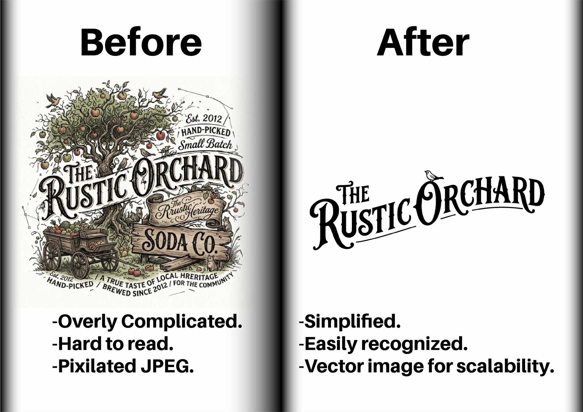
The Rustic Orchard poured everything they had into brewing sodas this community loved. But visually, they were completely stuck. They relied on the exact same clunky JPEG for years, and it honestly hurt to see a product with so much soul hidden behind tired branding. When they took the massive leap to introduce hard fruit ciders, they knew they couldn't keep doing things the old way. They needed a look that matched their ambition and spoke directly to a new crowd without abandoning their loyal customers.
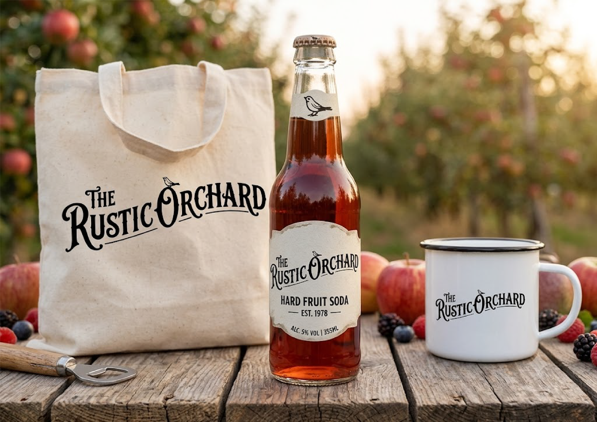
We stripped away the noise and built a crisp, simplified logo. They finally have an established identity that stands out on a crowded shelf. The Rustic Orchard still holds tightly to their deep local roots while giving themselves the opportunity to grow into everything they envision.